The Problem
With 16+ websites and a portfolio of dozens of complex products under Red Hat’s belt, consistent, clarifying design is critical for guiding users across the system. As Red Hat’s portfolio continued to grow, adding stand-alone products, product add-ons, product families, and product bundles–many with similar names (do you want OpenShift Dedicated, or OpenShift Data Foundation? What about OpenShift Platform Plus?)–it became increasingly necessary to visually set these types of product pages apart from each other.
The Process
First, I evaluated each of our product pages, identifying what content sections they contained (such as a feature highlight section or links to related resources), as well as what design system patterns these sections were using.
While there were a lot of consistent pieces I could use to start a standardized product page template, there were also some key areas where there was not a lot of consistency, as well as some that would benefit from strategic variation.
Creating Consistency
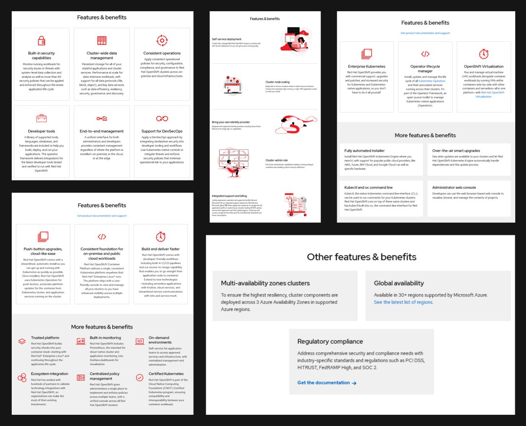
While each product page already contained feature highlights, how these sections were displayed varied wildly. They used different patterns, different types of content, and displayed varying numbers of highlights. Before choosing a pattern to standardize on, I wanted to understand how each pattern was currently performing. I used heat maps to show me which patterns were getting the most views, and how many feature highlights were actually being looked at.
After reviewing the data and consulting with product owners, I chose two patterns to standardize on, and gave guidelines for the use of each. One was most successful for showing 2-3 highlights that included video content, and one was best for showing 3-6 highlights that included only text. I also provided a data-backed word-count recommendation for the content.
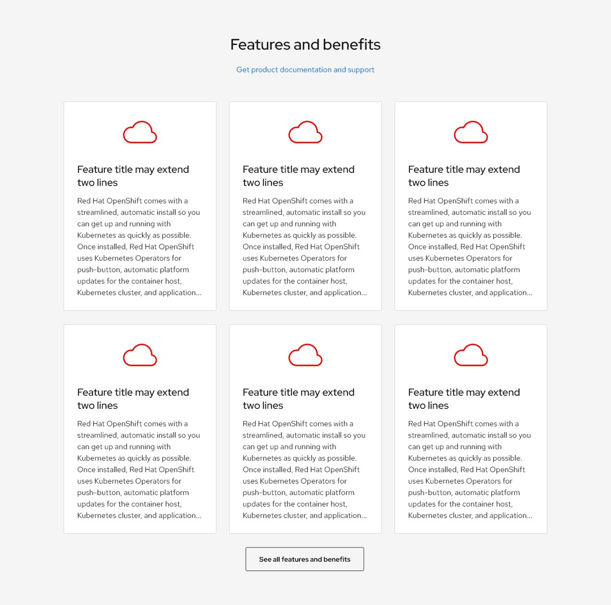
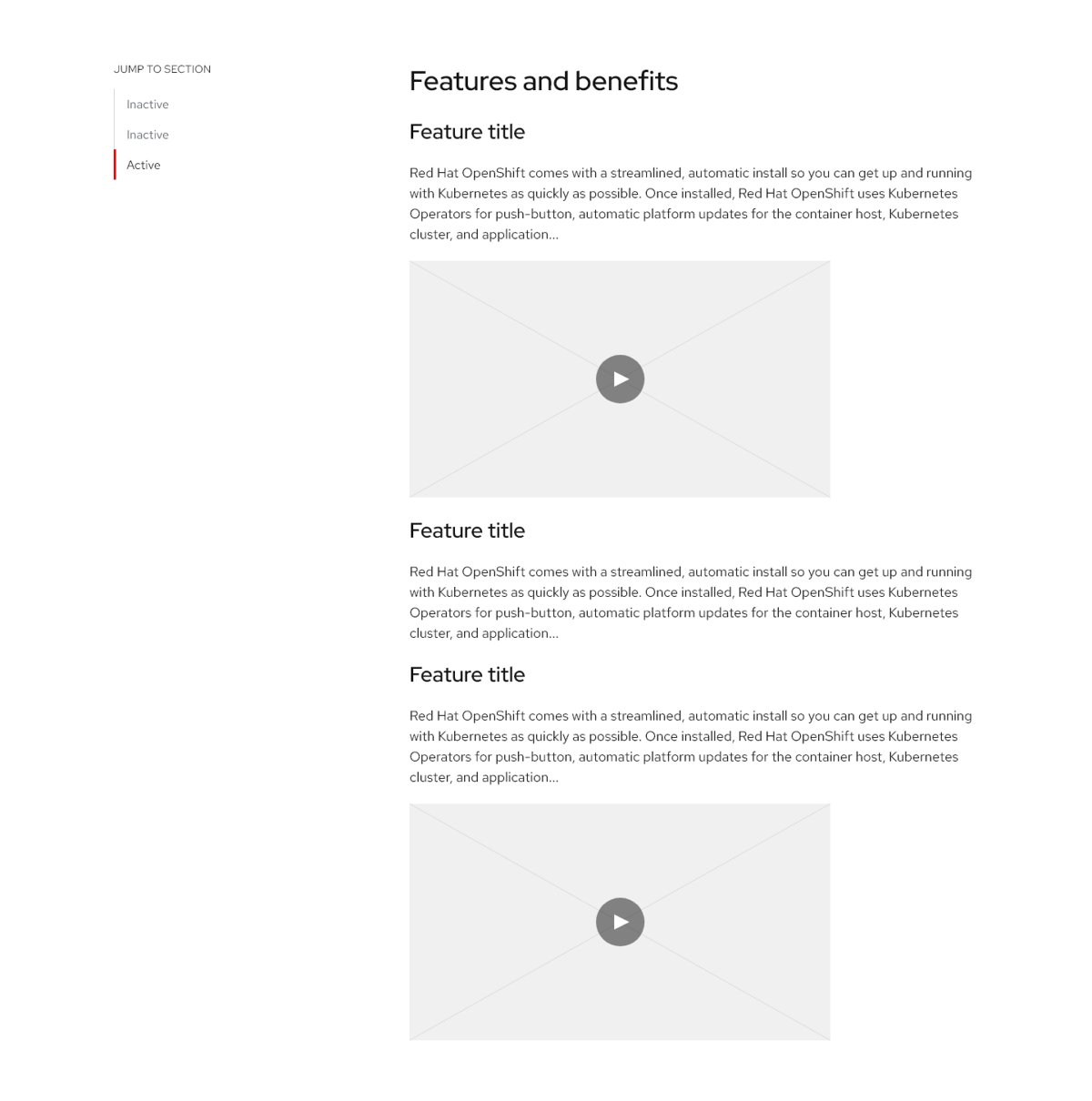
Differentiating Products
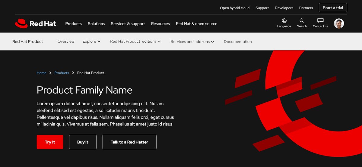
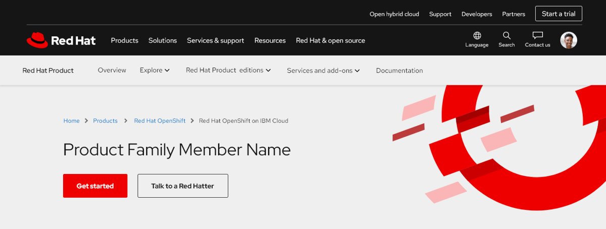
Although the product page heroes were consistent overall, this was the critical first look a user would have at a product page, and so was the most useful place to have intentional differences that would indicate what kind of product a user was looking at.
Expanding on the Red Hat design system, I defined how specific design options would be used to distinguish product pages from other site pages, and introduced new variations for product families and products within those families.
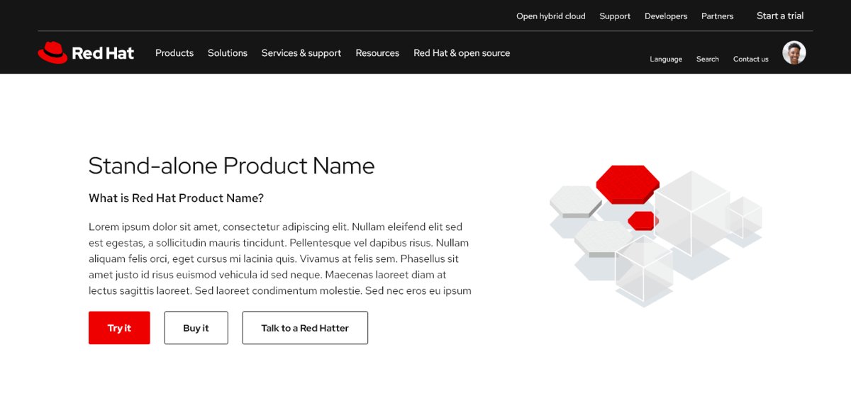
Additional Considerations
In creating product page design standards, I also considered the optimal page length for users to stay engaged, visual interest in the combination of patterns chosen, and variations for products that had special considerations.
Final solution
Here is one of the full product page templates I designed, including the sections described in this case study!
