UX Research at Red Hat
As the program lead for web UX research at Red Hat, I worked on all kinds of projects and experienced every stage of the research process, from creating and managing a project backlog, to designing and conducting studies, to analyzing and presenting results.
Project Goals
I led this research project in collaboration with a team of researchers and designers to evaluate a new design for the "Contact Red Hat" page on redhat.com. The goal of this project was to make sure the design team had the information they needed to create an easy-to-use page that met the needs of both users and business stakeholders. To that end, we wanted to answer the following questions:
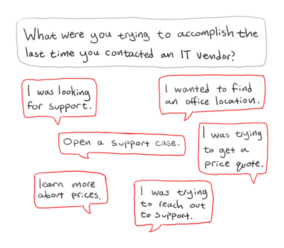
- What do users want to achieve when contacting an IT vendor?
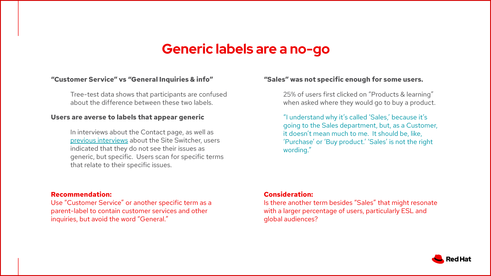
- Is the information architecture of our design enabling users to achieve their goals?
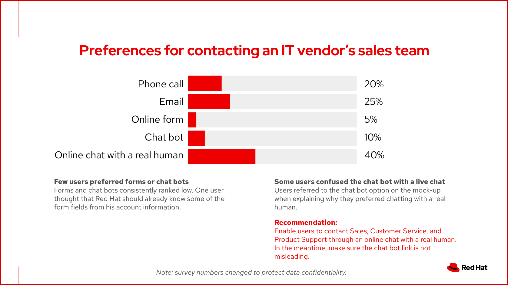
- What are our users’ preferred communication channels?
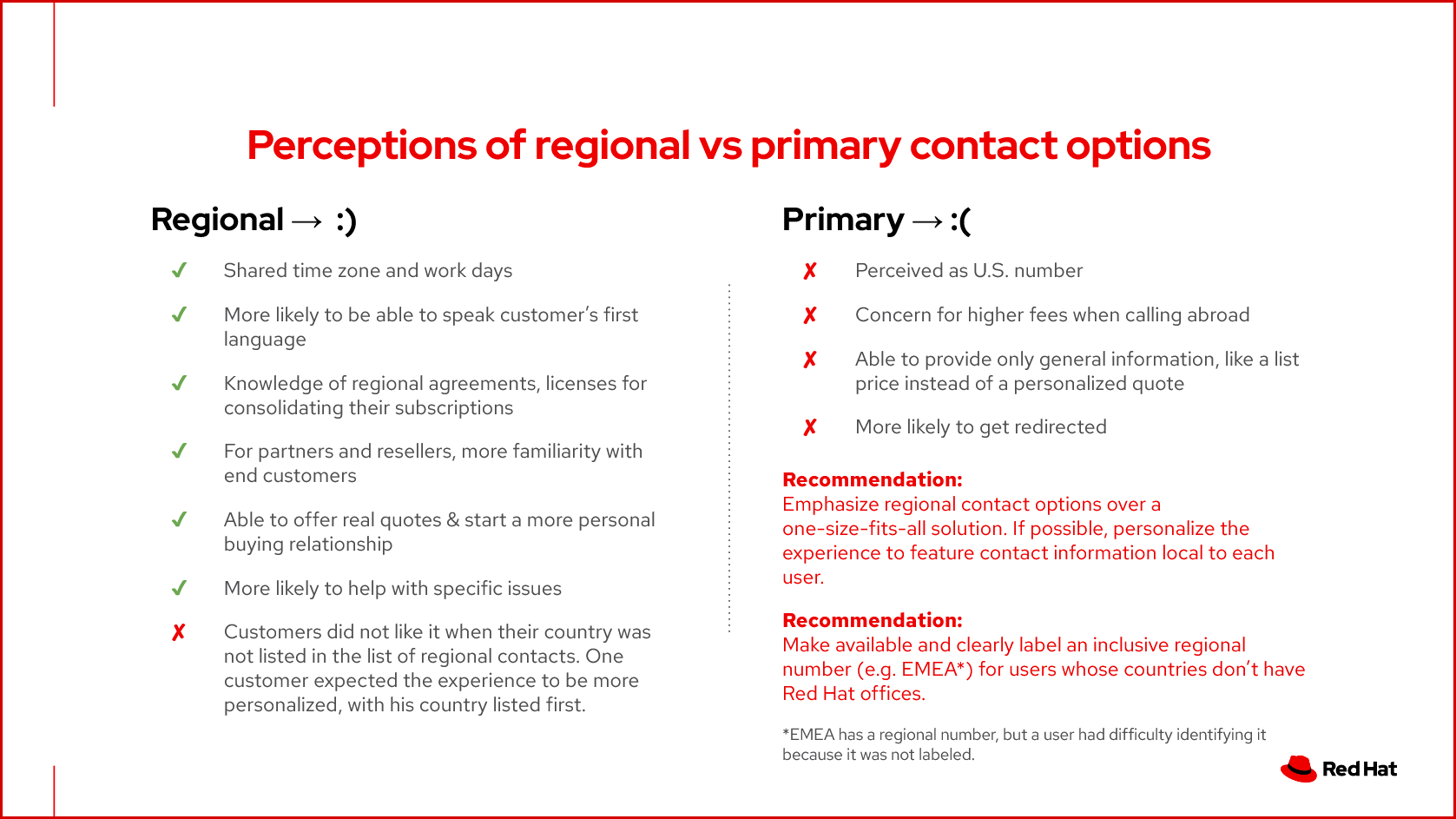
- How do users perceive the international vs. regional contact options?
We were interested in perceptions of international and regional contact options because they would help us effectively balance business needs (to route communications through a centralized point) with user needs (to be discovered).
Choosing Methods
Because some of our questions were more analytical, and others more exploratory, I decided to run the research in two phases: an unmoderated survey and tree test to answer the qualitative questions, and a small set of interviews to explore the full context of our users’ preferences. This approach additionally enabled us to iterate on the original design using the results from Phase I, and then test those changes in Phase II.
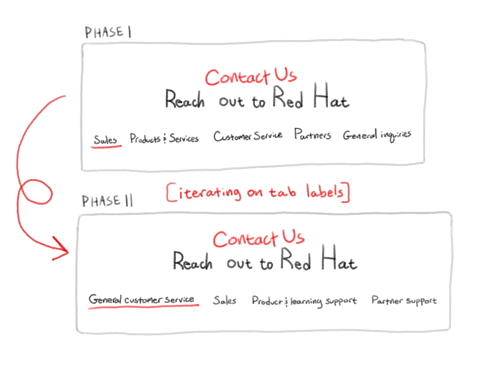
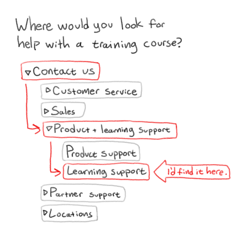
The survey phase allowed us to answer simple questions, like: What are your preferred methods for contacting your IT vendor’s customer service? What about the sales department, or product support? We also used a virtual tree-testing tool to test our information architecture. We asked participants to complete various tasks, (e.g., “Where would you go if you wanted to contact Red Hat to purchase a product?”) and analyzed their first clicks, in addition to their final destinations, to find out which labels were most helpful, and which had the potential to confuse.
With the interviews, we were able to explore the reasons behind our users' preferences, follow up on why certain labels led them astray, and have a detailed conversation about their preferences for international vs. regional contact options.
Samples from our findings
Here are some highlights of what we learned from this project. I’ll let slides from the results presentation do the talking!