typography • layout • photo manipulation
• typography
• layout
• photo manipulation
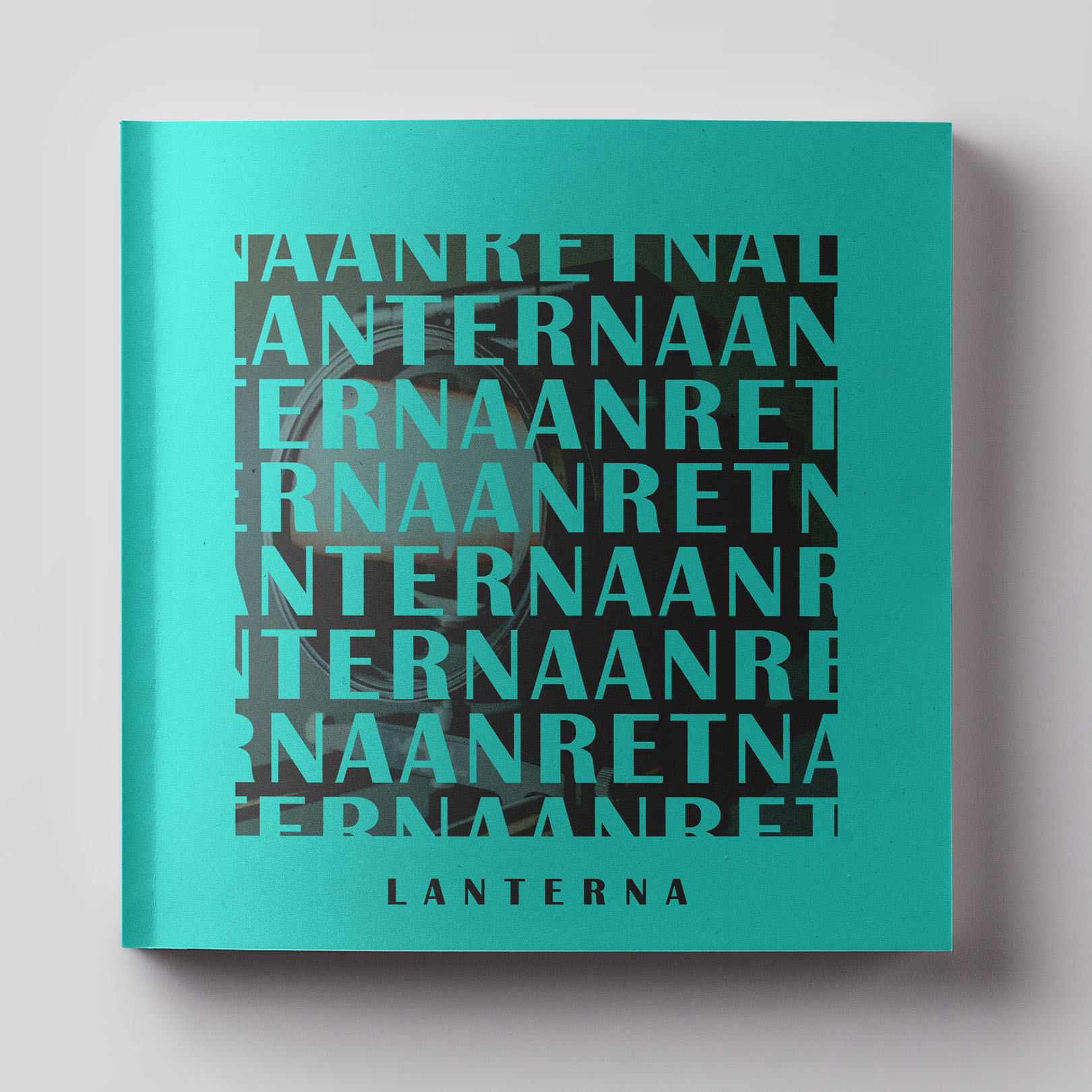
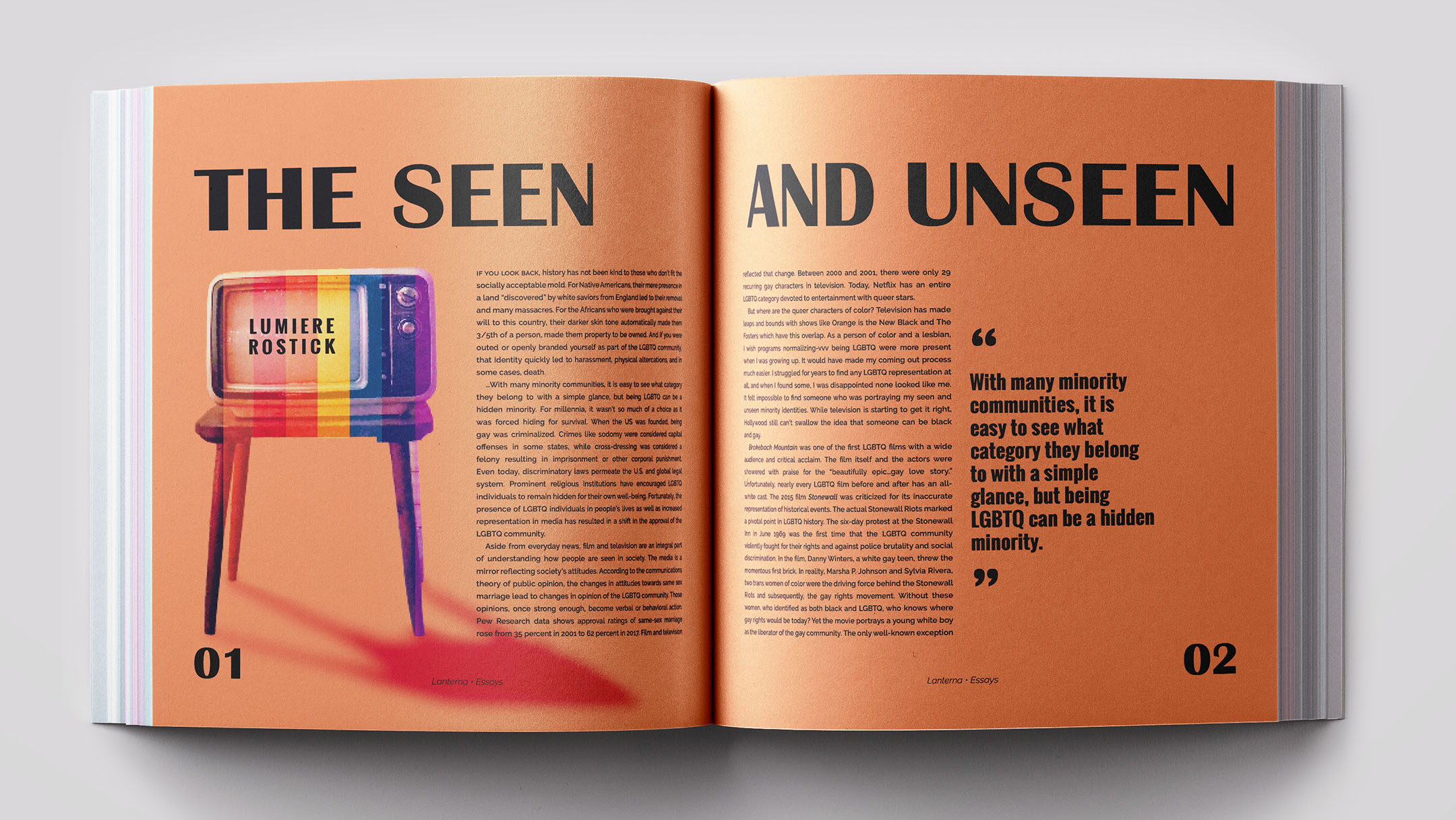
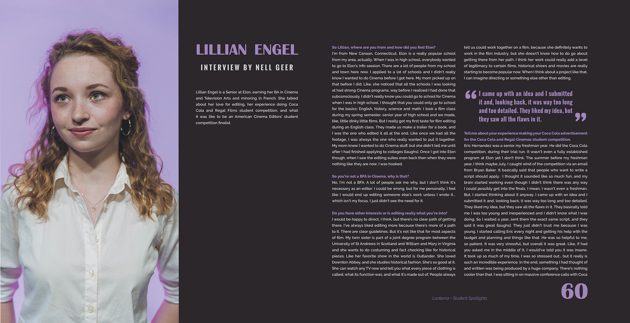
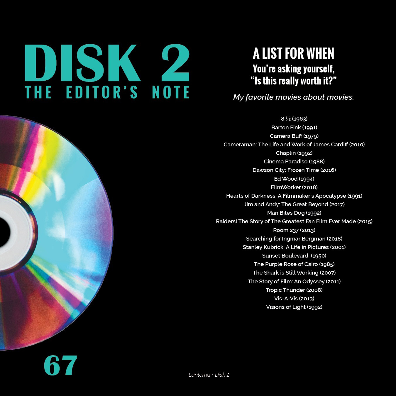
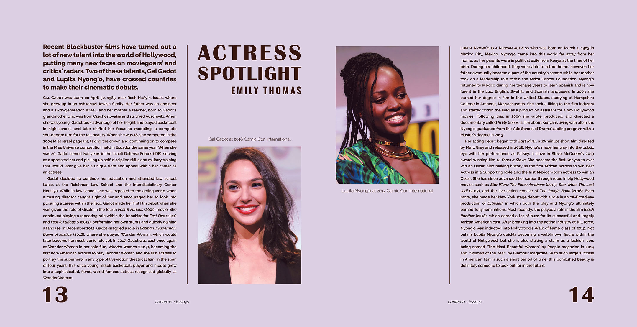
Lanterna Magazine was a student-run artistic film magazine. As the designer for the project, I created a style guide and executed layouts for 70+ pages of student essays and interviews. I worked closely with the editor to build the creative vision for the magazine and to meet technical requirements from the printer.
Layouts created with Adobe InDesign. Images edited with Adobe Photoshop.
